Thursday, 29 April 2010
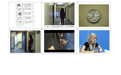
Q7. Looking back at your preliminary task, what do you feel you have learnt in the progression from it to full product?

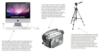
Q6. What have you learnt about technologies from the process of constructing this product?
(click on image to maximize and read writing)
Q4. Who would the audience be for your media product?
Q5. How did you attract/address your audience?
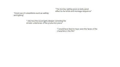
In terms of attracting our audience, we felt through the use of shots such as point of view shots that this would incorporate the viewer and make them feel as if they were the killer themselves. We didn't want to mislead the audience into thinking our film was a horror piece so instead of using vivid effects such as blood in the sink, we used very low key lighting and an outhouse sink to film this aspect of the montage. In terms of addressing an audience, we used younger characters around the target audience age, although hiding their identity in keeping with the enigma we wanted to create. Below are a few comments we received when the class watched our production piece.
Q3. What kind of media institution might distribute your media product and why?
(click on picture to maximize image)
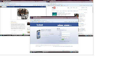
As said in the voice over, we think that highly popular social networking websites such as Facebook and Myspace to distribute our film, aswell as Youtube, with its increasing number of teenage users, an audience which our film is directed at. Sites such as Youtube are so popular, we feel that it would be easier for people to access and watch/gain information about the film in a shorter amount of time, and as many times as they want. It is a quick and cheap way of gaining an audience and something that doesn't require alot of money, which we don't have. We also thought that pirate radio stations would be a good way of letting our key audience of knowing about the film, after researching films such as Shifty which too was distributed this way. Sometimes we think that if a film has a major distribtution budget then it will automatically popular but in terms of our film we would rely on word of mouth and adverts or online posters on the internet to generate a hype or interest in our production.
Q2. How does your media product represent particular social groups?
Q1. In what ways does your media product use/develop/challenge forms and conventions of real media products?
Tuesday, 27 April 2010
Evaluation- audience feedback
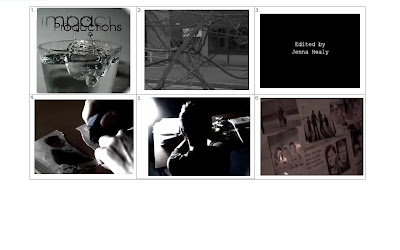
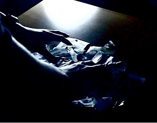 After a viewing of all the films in our class, in terms of feedback that we got it was overall positive. Classmates said that there was a good use of conventions for the thriller genre such as the mise-en-scene. The lurking point of view shot which we thought would add a sinister effect turned out well when the audience commented positively, as well as the build up of the montage sequence which they said created suspense, something which we were hoping for. They also agreed that the pace of shots worked well, in terms of the rapidity of the film. Another comment was that they liked the use of sound as it quickened as the plot progressed. A negative comment was that someone would have rather been able to see the faces of the characters in the film, however after considering this comment, this doesn't coincide with the effect of mystery and the enigma we wanted to create, hence the title Anonymity.
Thursday, 22 April 2010
Anonymity Final Production Piece
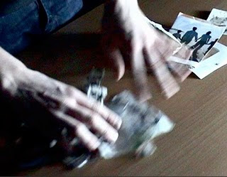
This is our final production piece for AS media. It is shorter than 2 minutes but we think it connotes the thriller genre well and in terms of conventions, we would like to think ours is traditional but with a more sinister and orginal twist.
Wednesday, 14 April 2010
Problems with sound
Sunday, 11 April 2010
Sounds
This sound is a breathing sound which we have incorporated at the end of our production piece as something that will hopefully create fear and a further point of view perspective making the audience closer or in the shoes of the killer. It will be heard after the title 'Anonymity' and will appear during the view of the photographs on the wall.
Music Research for Film
This is a non diegetic sound which we were thinking of using however we realised it sounded too unrealistic and didn't coincide with any of the shots that we had, making it look unspecific to the plot.
Music Research
This is a non diegetic sound that we considered using throughout the production as a sort of theme tune for the opening and title sequence. Once again we realised it wasn't the most accurate sound as it was too slow for the montage and rapidity of shots that we had.
Saturday, 10 April 2010
Further music Research
Tuesday, 23 March 2010
Difficulties with editing
We have found trying to get a suitable font difficult aswell because there are only a certain few that the mac wants you to use, so the font that probably will be on our final product won't necessarily match those that we have put onto our blogs.
At the moment, we are playing around with the title sequence we want to have, and where to place it. We currently have all of our shots the right length that we want, however there are disputes within our group as Lewis feels that the opening shots are too long, whereas me and Hannah disagree, as they are meant to be that length to juxtapose with the montage and so the audience can tell there is an ellipsis. Also, our film at the moment comes to 1 minute 25 seconds, which is not quite 2 minutes, however i think that if we cut anymore shots down, then this time will rapidly decrease and we won't have much of a film left to watch.
Friday, 19 March 2010
Final filming
Previously, we have filmed partial aspects of the film then edited when we had a lesson, and now we have uploaded the final scenes to the mac we can edit what's left and what needs editing. So far, we have put in place black screens and arranged all the shots in order. Also, there are now titles with our names on saying that we produced and directed the film. The word 'Anonymity' appears in the final shot as shown in storyboard however, the fonts that are available are ones we don't like, so we need to figure out a way of getting a typography that suits the film.
In terms of sound, we have found a perfect non diegetic sound for the ending which is 'breathing' as we want it to appear as someone is looking at the photos with intensity. We have a few other sounds decided yet we just need to place them where we think is suitable.
Tuesday, 16 March 2010
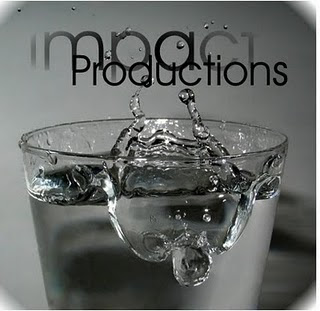
Our own production Logo
Monday, 15 March 2010
Production company titles
- Chiller Productions
- Through the magnifying glass Productions
- Anon. Cast Production Company
- Descicate Film Production
- Le Thriller Noir Theatre Company
- Penultimate Choice Productions
- Triversity Films
- The media 3 Entertainment
- Ridonely Productions
- Impact Productions
We will later decide which name to choose and then using coral paint and photoshop, we will create a logo that will look realistic and suit the genre of the film.
Sunday, 14 March 2010
Voice overs in film
Tasks for this week
The shots that we need involve lewis:
- Hand rummaging through newspapers/files/pictures
- A blade
- The back of his head in order to create Anonymity
- And the picking up of the smashed picture on the floor.
Thursday, 11 March 2010
Basic filming shots
This is a short clip of the filming that we have done so far. We decided to post this as a basis for primary use of an example of editing. However, we have done little editing to it so far and we want to use this so when we present our final film, we can look back and see what it started as. Obviously we won't have the ambient sounds that we have on there now, it will instead be non diegetic sound to build tension and anxiety. The shots will also be made darker to make the beginning look like it has been shot nearer night time.
Tuesday, 9 March 2010
Filming Various aspects of the montage
These were filmed at Hannah's house and in a dis-used barn, creating a more dark and sinister feel and undertone. These shots included;
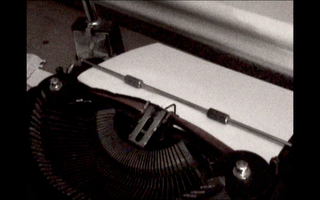
- The typewriter and the sound that we will hopefully be using at the end of the opening.
- The final shot of the pictures on the wall, with the faces scribbled out.
- The sink with what looks like blood running down it.
- Various other shots were filmed as to make the montage lengthier and more realistic: walking showing the feet of the killer, undefinable shots of light, silhouettes of trees, muddy work boots, a saw, spiders and writing of an intentional murder.
After filming, me and Lewis edited what me and Hannah had filmed, choosing which shots we thought looked of best effect and deleting shots that didn't suit the film we wanted.
Monday, 8 March 2010
Production company Logos
The production company titles that are shown here provided, usually, before the opening of the film, although sometimes they are shown when the film itself has finished. Obviously because our production will only be two minutes long, the production title will have to be at the beginning, then followed by other titles including that of the people who starred in the film, and us who made it.
In developing a production company title, in our group, we will need to sit down and decide a name, preferably one that will suit the genre of our thriller film. We will need to think about what colours we will use, i feel black or a dark blue will be best suited as it connotes that of a dark film. In terms of typography, a typewriter font that we are planning to include in our film will link especially well.
Task for week beginning 8th
We will need:
- A camera
- A tripod
- Certain props such as the dry cleaning bag as the body bag.
- Professional coats to show the two male characters as detectives.
This means that by next lesson we will have alot to edit and focus on making it look effective.
On wednesday, we will be filming the rest of what we've planned to film, including the final shots.This means we can begin to edit the rest of the film next week and it will give us plenty of time to make it look good.
Thursday, 4 March 2010
Typography
 I like this font due to the fact that it looks like it could have been written on a typewriter, ideal considering this is featured numerous times within our storyboard. A font such as this would be suitable for production titles etc however i dont think it's bold enough for the film's title.
 I particularly like this font as it appears as if it has been scratched or written nervously, and it also reminds me of the font used in the thriller Se7en.
 This font is bold, although i dont think it would suit our thriller opening as it looks more suited to an action genre film, rather than a psychological thriller.
 I really like this one as it again looks as it has been scratched or encarved into something, connoting that a sharp blade etc has been used to write it, giving the element of danger.
 This font is probably best suited to the title for our film as it gives the impression a typewriter has been used, which creates a better aesthetic quality in our production. I prefer how some letters are bolder than others, giving a variety.
 This reminds me of the typography used for 'The Ring' so i think it wouldn't be suitable for what we are planning to create through our thriller.
Photo manipulation

These are just some photos of a city landscape in leicester as in initial planning we thought of using a landscape such as this in our production.
The picture in the top left hand corner is the original, obviously taken in broad daylight and is a high angle shot.
Below it, i used a programme called coral photo paint to make the photo look a bit darker with more clouds.
The top right hand photo was made even darker so not all the buildings in the image could be seen, giving the illusion of nightfall, an effect we may use in filming.
And finally, below that, i made the city buildings a darker tone for it to contrast with the sky, along with a blurring effect just around the corners in a circle to make it look distorted.
experimenting with shots
This video is of experimentation with the use of camera angles and varying timed shots.
Lewis in our group filmed me and hannah walking numerous times out of various doors (filmed around countesthorpe college as an aid for practice of camera skills and use of equipment), recording our legs and feet in order to connote that the camera is focusing on these individuals who will play the two officer characters as they are significant and in our final production, will provide aspects of dialogue.
- The first shot is of a blue door with me and hannah walking out. The camera does not show our faces as we want to keep their identity a secret for purposes of adding more effect to the final production.
- The second shot is of us walking out the same door however this time from the side, and almost behind the door in order to create a kind of lurking point of view shot, a shot shown in our storyboard and what we want to include in the film. The camera also follows our feet moving.
- The third is of the same angle and place yet this time at the end the camera zooms in on our feet, although it looks good, i feel that if we are trying to create a point of view shot, this wouldn't make it look very realistic.
- Next, is a shot from the opposit side from which the camera was last, and this time more of a side view as we see me and hannah walk out of the door, and the shot is cut when we walk down the step.
- The final shot is a meduim shot of us walking out of another door, still not seeing our faces but more of the characters than the shots before. The camera then follows us walking for a bit ending on a shot of the blue wall panels.
I think in terms of point of view shots, long shots will be most effective due to the sense of 'lurking' and convention of 'stalking' which makes the audience uncomfortable for the characters being watched.
Green screen Experiments/practice
This is our short video of our experiment using the green screen. As you can see, the effects didn't turn our very well, with group member hannah appearing to be almost transparent. We used a worn down landscape background of what appears to be a tunnel, just to see how it turned out. This background appeared particularly well and in parts was in colour, as was the daylight city landscape of New York, a city often used in crime thrillers due to the conventions of the built up areas. A background shot of leicester city centre was used, however it only appeared in the colour of the green screen, and not in full colour that it is meant to be in. As this was a practice, we just had hannah walking back and forth to see how effective the green screen was, however we don't think we'll be using it as it doesn't give a good aesthetic quality, and we feel our filming will look alot better if we use realistic shots for backgrounds.
Wednesday, 3 March 2010
Photo storyboard for filming plans
Shot 1 : The first opening shot is of a black screen which connotes the beginning of the film. The use of black suggests danger and mystery as of what is to come. A production title may be included in this shot.
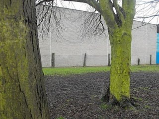
Shot 2 : Is a point of view shot from behind a tree, this is to suggest that someone is lurking there in order to spy/stalk the other characters we are planning to use. This automatically creates questions as to who the person behind the tree is and as to why they are there. In terms of sound, i think it will be silent, although there may be some form of scratching sound or music that is of a thriller genre. A long shot will prove more effective in terms of creating a realistic point of view shot.
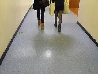
 Shot 3 : A medium shot of the two characters who will be police officers/detectives and of which we are hoping to include partial dialogue to represent that in their field of work there is an unsolved multiple muder case in which they are discussing certain aspects. This is to connote to the audience that a killer is on the loose, and point of view shot that it will be filmed with shows that the murderer is listening in on them, both characters unaware.
Shot 4 : Is of a door, which will lead to an office or business room to show the killer is actually in the police force himself. Although this is a medium/long shot of a door, i think a close up of a door with a production title or name on it will prove more effective.
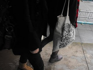
Shot 5 : A medium/close up of the two detectives walking away from the building, still no focus on their faces as to convey a sense of 'anonymity' again and to keep the focus on just the dialogue, an important basis to the film opening plot.
Shot 6 : Cuts to another black screen, used to connote a sense of fastforward time, a convention often used in films to show this and to confuse the audience as to what is going to unfold. This shot may also include another title for a production company or a name of a character, in effect invloving the title and opening sequence together.
Shot 7 : the black screen fades to a back shot of the main male characters head, hiding his identity (this is why i think Anonymity is a good name due to the fact that we never actually get to see the killer or any other characters in order to create a sharper focus on the surroundings and other filmed aspects. This shot will shot the character at his desk in his office, again to prove he is the killer which no one suspects, and is a medium close up shot. The shot will be quite dark, suggesting it is nightfall, creating an almost eerie quality to it.
Shot 8 : Cuts to another black screen, providing as a device to begin the montage of shots in which parts of the killers motives will be revealed. This shot may include titles however i think it will be more effective if it is left just completely black as to connote that it is different to the other black screen which we have used. The music as this point will change to that of a sharper, quicker and non diegetic sound which was not previously heard, also to convey that the direction in which the film was heading has changed, invloving a series of flashbacks aswell as current aspects which will continue to disorientate the audience.

Shot 9 : The black screen then cuts rapidly to a close up shot of a smashed picture frame on a hard surface floor to show an act of violence has lead to the breaking of the frame. The picture it holds will be of a family; a man with his children, connoting the man in the photo may be the killer, and provides questions as to what has happened to the children and the happy time it holds. The non diegetic music continues.
Shot 10 : Will be the main character typewriting, or will show extreme close up of the typewriter letters in order for the auidence to work out that he is planning his next murder. Along with the non diegetic music, the ambient sound of the typewriter will be heard.
Shot 11 : Another extreme close up showing a cutting instrument, either scissors or a blade showing the faces have been cut out in a photograph of another family.
Shot 12 : A black and white shot of a canal at night will provide as a flashback from the main characters' mind where a shot of the character himself will be seen standing by the water, looking suspicious. The non diegetic music stops and the sound of the killers hearbeat/breathing will be used to convey a sense of urgency and danger.
Shot 13 : The picture used here will be the same used for shot 14, however when filming, a jump cut will be used from the main character standing by the canal to a shot of him standing over what appears to be a dead body, with the prop of a dry cleaning bag for the same look as a body bag.
(Shot 14 : This picture will be used twice in the storyboard, but in filming it will be of the main character standing over a dead body.) The jump cuts will show the man dragging the body.
Shot 16 : A close up of the water in the canal, connoting that the dead body has been placed in the water, in order for the killer to cover his tracks. After this shot, the sound of the killers hearbeat/breathing will cease and the non diegetic music of before will start again, we may decide to add the sound of a splash to convey the body being put into the water.
Shot 17 : Is a close up of a sink, the image will still be in black and white, and the audience will see what looks like blood pouring down the sink, another convention of thriller films that we find effective. The use of black and white shots will enable us to use an ink or food colouring in order for it to look like blood, something that, for me, was influenced from the film Psycho, with the infamous shower scene.
Shot 18 : For this close up shot, hannah used a post it pad as a prop for a police badge which we are intending on using. This will indicate once again that the murderer is in the police force, right under his collegues noses.
Shot 19 : Shows the man taking the picture out of the smashed frame. It will hopefully show that this photo means something to him and is of importance. The smashed glass will make it look more effective and as said in the risk assessment, it will be controlled in order to make sure no one is harmed. The hands of the character will be shaking and frantic to create anxiety.
Shot 20 : This overhead shot will show the typewriter again to build up tension, with the non diegetic music dying down for the sound of the typewriter to be gradually grwoing louder and louder. This will cause more tension.
Shot 22 : will be a black screen showing the film's title Anonymity in the font, i think, of the typewriter, to make it look more genuine and realistic. This will prove as the ending of the title sequence. The black screen however, isn't a fully black screen, it will be a pitch black room...
Shot 23 : The ultimate shot will bring the opening sequence to a close and is perhaps the most significant. In the pitch black room, the light from a flashlight will uncover a wall containing mis-mathced photographs of families, and the disturbing factor will be that the faces will all be cut out. All will be silent and the only sound will be the breathing of the main character.
Task for week beginning 8th (and shooting schedule)
We are planning to film certain aspects of our production so the week after we can spend more time editing and getting the right shots that we want. This means if there are shots or parts that we dont like, we can decide as a group to film it again.
Monday 8th: Begin filming first few shots of our storyboard, including the walking of the two characters, aswell as the point of view shots.
Wednesday 10th:Filming various other shots ... continuing with storyboard sequence to get best possible effect.
(throughout various days in the week we will make time to shoot the canal scenes with the body bag.)
Monday 15th: we hope by this time that all filming will be done filming the basis of our film, and will use this day to film any final aspects that we need which we feel will be appropriate.
We are hoping to stick to the schedule and task however due to unforseen circumstances we know that this may not be possible, although we will make time to film all the essential shots to the standard we feel is good enough.
Costumes
Main character; as shown in previous planning, will wear a black trench coat or a professional coat to show he is a business man.
Black trousers and shoes will also be suitable in completing the overall aesthetic quality of the look.
We may perhaps use a wedding ring in a close up to show he is/was married - acting as a device for possible explanations as to the pictures of families throughout the montage.
The two people are planning to use for characters of the detective/police officers will be in formal attire also, wearing either the colours of black or grey clothing.
There will be no other costumes that we plan to use as there aren't other characters of importance, except for the multitude of pictures with the faces cut out.
We will only see the main character in various close up and medium shots to keep a sense of mystery and create an enigma.
Risk Assessment
- Matches are planning on being used to connote the sense of danger and to contrast with the darkness of the shot. Issues with this could be that something could be set alight, however it will be in controlled conditions where we make sure no harm or damage comes to anyone or anything.
- Smashed photo frame - the glass could cut someone although we are only planning to use it for show, and safety cautions will be provided.
- The blade/or cutting object - Will also only be used as a prop (if we plan on including it at all) and is used to connote the audience it was used to cut out the faces of the people in the pictures.
- Water in the canal - We know that we will have to be careful when filming near water due to the equipment such as the camera's and tripods etc.
All these things do pose risk to others however if done responibly and correctly then no harm or damage will be done to anyone or any other props or locations, and the overall eventuall film will look of better and higher quality.
Tuesday, 2 March 2010
Props needed for filming
For our male lead character:
- a trench coat, preferably black to connote his professionality and show or hint to the audience he is in the police work force (later shown by the badge we are hoping to involve.)
To establish different environments, we will need varying props:
- Documents containg writing to show a working environment of an office.
- A picture frame which will be smashed, at first it will be turned over so the picture cannot be seen, connoting mystery.
- A match or lighter will be light but no cigarette or anything harmful being done to any cast member or any of the props or locations we are planning to use.
- A variety of pictures, which we are hoping to make photographs, will be needed when the character fummages frantically through them, the photos will contain families, all varying and seemingly having no connection.
- A cutting object of some sort will be used for the cutting out of faces on the photographs.
- A dry cleaning bag or a large bag of some sort to suggest a body is being dragged into the canal.
- A sink, which we are planning to shoot in black and white, with various aspects of the montage, which will be needed to show what looks like blood running down it.
- An ink of some sort for the effect of blood, the colour doesn't matter due to the black and white 'film noir' effect.
- A police badge to show a sense of background to the character.
- The typewriter we are going to use will be for the sound effect of the film title at the end.
- A flashlight - which will uncover the pictures at the end of the 2 minute production.
We know that it may not be possible due to safety reasons that we can't use certain props for filming however we could make alterations during shooting the film.
Film Title research
Instead of producing a survey or questionnaire, we decided on two film titles which we would want to use in our final product. As our target audience is 15 to 24 year olds, we thought it would be suitable to interview people of our own age group. We asked which name for a title of the film sounded better; Anonymous or Anon. as these two names are very similar, the latter one an abreviation, we decided they are suitable for the mood and plot of our production. Due to the responses we got, Anonymous was a clear choice, with Anon. proving to be too short a title.
Locations for filming
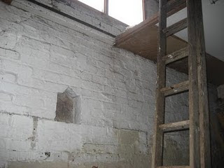
For our 2 minute production, we are creating a shooting schedule which will act as a guide for us, hopefully proving successful. Aswell as this. we need to decide where we will film for our movie, as we need convincing and suitable places to make the production look the best possible.
Locations that we are planning to use will hopefully be easily accessible and effective in the final production of our film. Some of the locations are ;
- School (seperate locations with the use of trees for our point of view shots especially), we will need to use probably only a few shots including parts of the school as we think it will look different and effective if there aren't many shots filmed in school or on site.
- By a canal where we will film aspects of the montage including jump cuts of our lead male character hovering over and moving a body bag.
- We will need a shot of the water in the canal for the view of the rippling water connoting that the body has been placed there. This will also relate to the sound which we are planning to combine of the splashing water.
- Hannah's barn which contains the sink we will use, aswell as the final shot for the wall containing pictures. The final shot portraying the pictures shown by a flash light torch will probably be our most important and significant shot as we need an ending to the film which will leave the audience hopefully mystified and wanting to know what happens.
I think the fewer locations we use will be more effective in terms of having enough time to shoot it, meaning we can spend more time editing which will need. I dont think limited locations will make our film look of less quality either.
Friday, 26 February 2010
Tasks to do this week
- Filming various people of our target audience to ask them what name they think is best suited for the title of our film.
- Experiment with the green screen and see what effects look of good quality, and if successful we could use certain aspects of the green screen in our film.
- Film and post short filming that we've done of walking which will be in our film, including a variety of shots which will proivde us with research as to what shots will be used in filming.
- Plan locations where we are going to film and check if they will make the filming easy and accessible to film.
- Costumes and props will be essential so we will need to plan what we will be using and include them in our storyboards.
Wednesday, 24 February 2010
Thriller typography and mood board
Planning for Audience research
 In terms of planning for our short film, i think that it would be effective to get the views of cinema audiences and those who watch films of this genre often. I am planning to provide my results in the form of video, which will enable the viewer of my blog to see how people felt and responded to the questions i asked. This would be efficient than just using a questionnaire, and i think we could get some really interesting and useable feedback which we can apply to our own production. Obviously it is ideal that we interview and pose questions to people of 15 and above, due to the certificate we think is suitable for the film.
 Tuesday, 23 February 2010
Certificate of the film
 In our group, we feel that a certificate of 15 would be suitable as our it includes our target audience of 15 - 24 year olds. A certificate of 15 means :
 Horror: Sustained or detailed infliction of pain or injury is unacceptable.
Thursday, 11 February 2010
character planning

This is an initial idea of how we want our main male character to look. Hannah created this image of the police detective who will feature in our short production. The bowler hat is to cover the face of the person playing this role, this is because we don't want the audience to see the actor's face, creating an enigma and suspision as to who he is. The long trench coat connotes that he is a professional, as does the tie, and also in the use of his costume, we are trying to represent and show the 70's era, in which we will hopefully be using to establish the setting and basis of our production.
Spider Diagrams of initial planning and ideas
Sunday, 7 February 2010
Hannible - Analysis of title and opening sequence for film
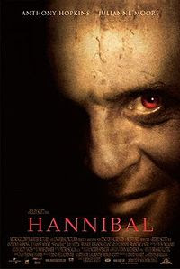 Hannibal is a psychological horror/thriller film starring Anthony Hopkins as the cannibal, Mr Hannibal Lecter. The film is set ten years after the infamous thriller 'Silence of the Lambs'.
The opening sequence begins with a black background, connoting death or danger.
Non-diegetic music of which sounds like a piano is played whilst the black background is still on the screen. The music sounds from a previous era, suggesting the setting will be either old fashioned or set years ago from present day.
A male voice can be heard, however it doesn't seem to be a voice over like in so many of the Film Noir movies. This creates an enigma for the audience as there is no identity yet who the voice belongs to.
Red font/typography appears from out of the black screen saying 'Universal Pictures'. The writings is medium sized and quite thin, with the red giving the impression of blood or danger.
Another male voice is introduced but no faces as yet, however the audience can understand that there is a conversation taking place, even with no images.
The red font fades out with the introduction of more titles.
A small, unrecognisable white square appears and zooms closer, becoming enlarged. The title of 'Scott Free Productions' is shown to the left of it.
The white square is close enough now to appear as a television screen or the stage on a theatre, creating confusion for the audience as to where this is set.
The square is still surrounded by the pitch black background however three figures become apparant, and the voices are recognisable as those from before.
There is a black middle aged man sat casually on a chair, across from a man in a wheelchair and another standing next to him. The faces of the people have not been shown as yet.
A long/meduim shot establishes the setting of where this 'meeting' is taking place. It appears to be a large living room in a house, however the grand furniture and royal colours connote that of wealth.
The camera continues zooming in.
The once white square now takes up the whole screen, although still no emphasis on the faces.
Ambient and low key lighting connotes danger and perhaps plotting from the three characters.
Non diegetic music is still quite mellow.
Point of view camera shot suggests that someone/something is lurking or listening into the conversation.
A close up shot of the man in the wheelchair shows his face to be very disfigured, creating a shock for the audience.
The camera cuts back to the black male character, with a shot reverse shot of the two conversing.
A low angle shot of the disabled man portrays the background of the grand fireplace, once again connoting wealth.
A man is stading by his side wearing a formal suit, with his body turned slightly towards the man in the wheelchair, suggesting he works for him.
The black male character picks up a pink box and walks to the other man.
An over the shoulder shot reveals the standing male character unravelling the box, with red curtains and book cases connoting historical and old preferences from the owner, suggestively the disabled man.
A low angle shot shows the man's reaction to what is inside the pink box, whilst the camera continues to zoom in.
The calm non diegetic music stops and becomes an almsot ambient sound of the wind, connoting events are about to take a more sinister turn.
Finally, we see what is in the pink box. It is a human face mask with metal bars covering the mouth. It looks almost animalistic and perhaps belongs to Hannibal himself.
A high angle shot zooms into the mask, which then fades out. And the red font re-appears with the film title 'Hannibal' in a fancy typography.
The title sequence follows from this with the actor's names appearing in white bold writing.
A series of black and white images appear as if they are CCTV or surveillance tapes, connoting that of police and detectives. There is the non diegetic souns still of the piano, although there is the diegetic sound of police radios.
Thursday, 4 February 2010
Initial planning for our film
Our thriller film,we have decided, will be a certificate of 15, as we intend to aim it at teenagers and young adults between the ages of 15 and 24. In terms of a storyline, the two minute opening will give away certain aspects of the plot to set a basis for the audience, however as it is such a short production and only includes a title and opening sequence, a storyline is not essential, although for our main character, some background information will be provided from the initial setting of the film.
1. The film will be set in the 1970's, as a result of the intention to break away from stereotypical conventions in which thrillers of the modern day are often set.
2. The male main character will be the ideal serial killer due to his servitude in the police force as a detective, in which he will obviously not be the one to be suspected.
3. Although his face will not be shown, the audience can establish he is a man from various shots of his head, hands and attire, in which he will most likely wear a formal, professional suit.
4. The character is a family man, provided by the photographs of a wife and children, leading onto the psychologically disturbing pictures of various unidentified families, with each and every face cut out, leaving just the bodies.
5. The initial opening will be followed by a montage of clips, which are additioned by title and production names of multiple made-up companies that will link to the film appropriately.
6. Each shot will be of a rapid pace, in a style of flashbacks (relating to the element of film noir).
From the eventuallity of the montage and clips, an intention of what is to come is given to the audience.
This initial planning may however change for whatever reasons, whether it any of our ideas will be inconceivable with the time and resources we have.This planning acts as a basis for our later research.
Monday, 1 February 2010
Production on film - group/genre
Thursday, 28 January 2010
Film Noir
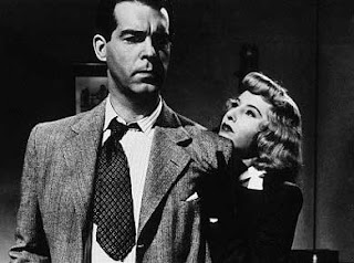 Double Indemnity
A film released in 1944 starring Fred MacMurray and Barbara Stanwyck, directed by Billy Wilder.
The title sequence contains the names of those who produced and worked on the movie, with the enigmatic shadow of what appears to be a man limping forward on crutches. This creates mystery towards the figure the audience see, and the shot of the character closing ever nearer becomes quite menacing. Strong non diegetic music plays over this sequence with what sounds like drums, getting louder in effect creating a climax. The sequence then cuts to a long shot of a cross roads at night, showing a car speeding and cutting off traffic, which then defies the stop sign, connoting a sense of rushing. The car comes to a halt, and the male character is shown with his back to the screen, once again supporting that of a mysterious person as the audience cannot identify with him. The male character has a costume of a hat and a long coat, suggesting already that he is professional and a business man, although his apparant limp and one word answers suggest he may be hiding something. The male character is seen in an office with the typical noir trait of venetian blinds in the low key lighting reflecting back onto, suggesting this character has committed a crime. The non-diegetic music continues, although less menacing than before, and it ceases when the man begins to talk, connoting focus on him and his 'confession' of murder. Another element that is typical of noir films is the flashback, narrated by the man confessing how he came to have murdered someone. The previous year is shown, with the bright ambient lighting from the sun contrasting with the dark current state in which the man is narrating from presently.
Overall i think that some of the film noir elements such as the flashbacks are quite effective is used appropriately, as in thriller films this proves to work in the re-telling of how events of crime or murder unravelled, and this would be something i would want to progress with when producing our 2 minute opening sequence.


